Michelin full name: SCA Compagnie Générale des établissements Michelin, is a tyre manufacturer based in Clermont-Ferrand in the Auvergne région of France. It is one of the two largest tyre manufacturers in the world along with Bridgestone. In addition to the Michelin brand, it also owns the BFGoodrich, Taurus, Riken, Kormoran and Uniroyal (in North America) tyre brands. It is also notable for its Red and Green travel guides, its roadmaps, the Michelin stars that the Red Guide awards to restaurants for their cooking, and for its company mascot Bibendum, colloquially known as the Michelin Man.
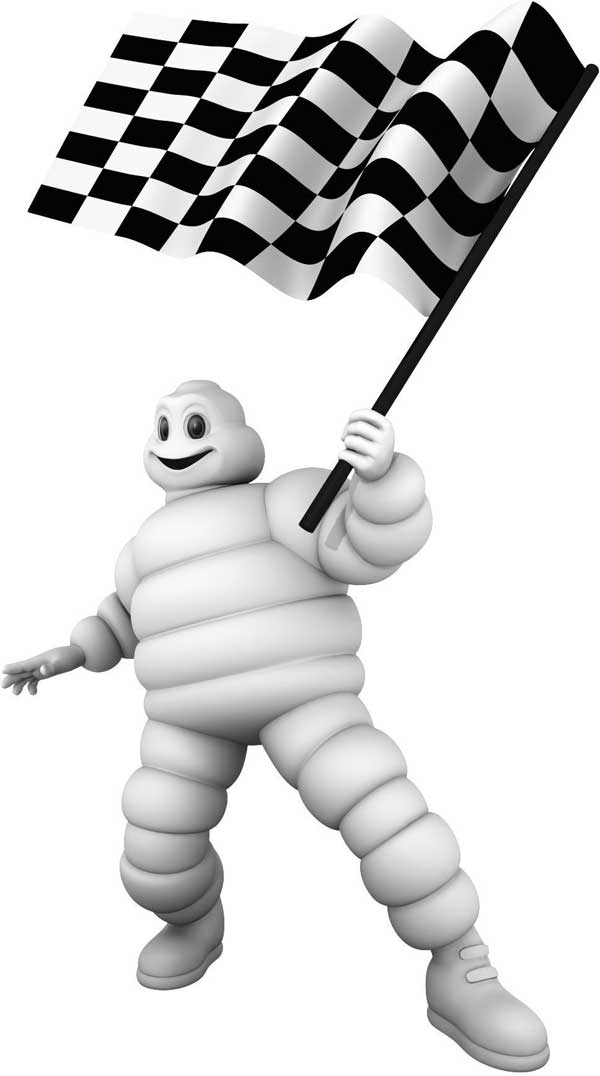
Bibendum, commonly referred to as the Michelin Man, is the symbol of the Michelin tyre company. Introduced at the Lyon Exhibition of 1894 where the Michelin brothers had a stand, Bibendum is one of the world's oldest trademarks. The slogan Nunc est bibendum (Now is the time to drink) is taken from Horace's Odes (book I). He is also referred to as Bib or Bibelobis.
While attending the Universal and Colonial Exposition in Lyon in 1894, Edouard and André Michelin noticed a stack of tires that suggested to Edouard the figure of a man without arms. Four years later, André met French cartoonist Marius Rossillon, popularly known as O'Galop, who showed him a rejected image he had created for Munich brewery—a large, regal figure holding a huge glass of beer and quoting Horace's phrase "Nunc est bibendum". André immediately suggested replacing the man with a figure made from tires. Thus O'Galop transformed the earlier image into Michelin's symbol. Today, Bibendum is one of the world's most recognised trademarks, representing Michelin in over 150 countries.
The 1898 poster showed him offering the toast Nunc est bibendum!!.. to his scrawny competitors with a glass full of road hazards, with the title and the tag C'est à dire: À votre santé. Le pneu Michelin boit l'obstacle ("That is to say, to your health. The Michelin tire drinks up obstacles"). The implication is that Michelin tires will easily take on road hazards. The company used this basic poster format for fifteen years, adding its latest products to the table in front of the figure. It is unclear when the word "Bibendum" came to be the name of the character himself. At the latest, it was in 1908, when Michelin commissioned Curnonsky to write a newspaper column signed "Bibendum".
Since 1912, tires have taken on a black appearance because carbon is added as a preservative and strengthener to the base rubber material. Before then, tires took on a gray-white or light, translucent beige colour. This helps explain why Bibendum is white, though modern tires are black.
The name of the plump tire-man has entered the language to describe someone obese or wearing comically bulky clothing. (e.g. "How can I wrap up warm without looking like the Michelin Man ?")
Bibendum's shape has changed over the years. O'Galop's logo was based on bicycle tires, wore pince-nez glasses with lanyard, and smoked a cigar. By the 1980s, Bibendum was being shown running, and in 1998, his 100th anniversary, a slimmed-down version became the company's new logo. He had long since given up the cigar and pince-nez. The slimming of the logo reflected lower-profile, smaller tires of modern cars. Bib even had a similar-looking puppy as a companion when the duo were CGI animated for recent American television advertisements.
A history of the emblem was written by Olivier Darmon and published in 1997: Le grand siècle de Bibendum; Paris: Hoëbeke.
